
sharing from ctmh's blog...
For the Love of Color: A New Color Wheel!
It is officially love day, and we couldn’t be more excited! Valentine’s Day is a time designated to focus on and celebrate the relationships that matter most, and, in case you didn’t know, you are at the top of our significant others list as part our beloved crafting community! We simply couldn’t let this special relationship go unnoticed, so we made you a one-of-a-kind Valentine that we hope you’ll enjoy!

Download your new CTMH color wheel, here! 
We updated the color wheel we shared with you last year to include this year’s new colors from our exclusive color palette!
Since we’re celebrating relationships today, we thought it would be fun (and practical) to talk about relationships between colors and what makes certain pairings work. We’ve summarized color theory principles from previous blog posts and compiled them, below, to have them conveniently available for review all in one place.
Once you’ve chosen basic colors using any one of these combination options, jump on the Close To My Heart color wheel and take your pick from the exclusive colors that fall into each category. If you’d like to learn more about any of the individual principles or would like to see more artwork examples, click on the provided links at the end of each section. Lastly, if you don’t have the time or would simply rather not read through color theory (we get it  ), skip to the end of this post to see how we make using a full spectrum of color even easier!
), skip to the end of this post to see how we make using a full spectrum of color even easier!Monochromatic and Analogous Colors:

Monochromatic color designs make use of a single color that varies in lightness and saturation. Sometimes, a piece of artwork that we may think is monochromatic is actually following an analogous scheme, which is just a fancy way of saying that the featured colors are next to each other on the color wheel. One color is typically dominant while neighboring colors are used to enhance the design. (Monochromatic and Analogous Colors)
Complementary Colors:
Complementary colors are two colors opposite each other on the color wheel, such as Candy Apple and Clover (red and green), and Goldrush and Bluebird (orange and blue). If you notice, one side of the color wheel is made up of warm colors while the other is made up of cool colors. Complementary colors, since they are across from one another, will have one of each. They create a vibrant contrast, making each other pop without being jarring to the eye. (Complementary Colors and How to Use Them)
Split-Complementary Colors:
Split-complementary colors are pretty much what the name implies. When you are using two complementary colors, split one of them into its two adjacent colors on the wheel to end up with three colors that will visually work. Take red-orange and blue-green, for example. They are opposite each other on the color wheel and therefore complementary. Add a third color using the split-complementary scheme by splitting red-orange into two and use red and orange with the blue-green instead. (Using Split-complementary Colors)
Triadic Colors:
A triadic color scheme is a lot easier to understand than it may sound. Just like some of the other theories, triadic color combinations make use of three colors. This time, instead of being next to or opposite each other, triadic colors are three colors that are equally spaced around the color wheel, and when connected by lines create an equal sided triangle.
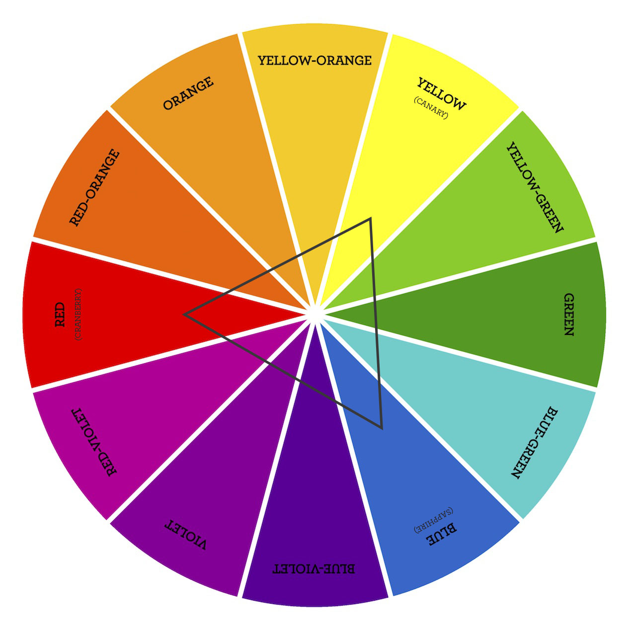
There are only four triadic color combinations on your basic color wheel:
- Red, Yellow, Blue
- Red-orange, Yellow-green, Blue-violet
- Orange, Green, Violet
- Yellow-orange, Blue-green, Red-violet.
Double Complementary Colors:


In a double complementary scheme, we use a combination of four colors that, as the name implies, is made up of two complementary color pairs. (Remember, two colors are complementary if they are opposite each other on the color wheel.) To make it even easier, this kind of color combination is also known as rectangular colors because, when the four colors are connected on the color wheel, they form a rectangle. (Double Complementary Color Schemes)
After reading, reviewing, and applying these color principles it’s easy to see that making harmonious color combinations isn’t so hard. Keep that trusty color wheel close by and pick your colors with confidence!
We also know that color theory isn’t for everyone. If you fall into this category or would like to see pages and pages of artwork examples that we’ve come up with using these principles, then Love of Color is for you.
Love of Color
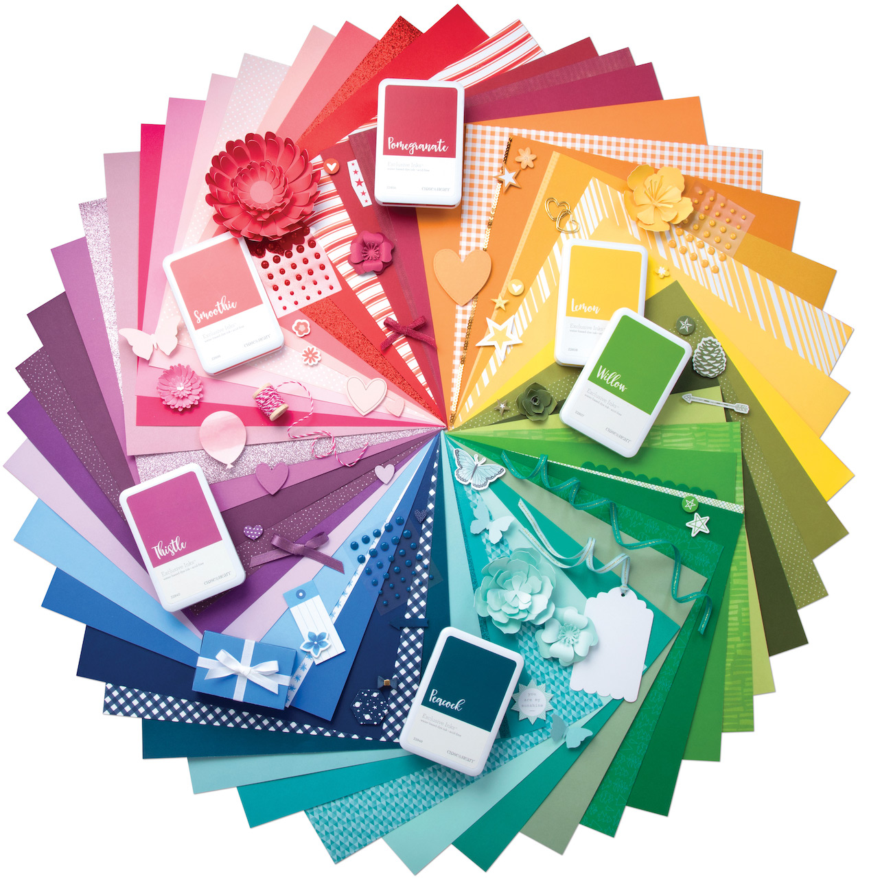
Love of Color is our latest how-to book, and through its pages the exclusive Close To My Heart color palette comes to life! In it, breathtaking artwork illustrates how to create beautiful and perfectly balanced color combinations without any guesswork. Each spread in this book starts out with one exclusive color that is then combined with two, three, and four other exclusive colors, shown in beautifully crafted inspirational artwork.

This layout was created using one of the three Smoothie color combination options offered in Love of Color. In this example, Smoothie was paired with Ballerina, Eggplant, New England Ivy, and Heather. Smoothie is the dominant color and the others were used to create accents throughout.


Thank you for being our Valentine today and joining us through this celebration of color! We hope that you are always living your life in full color and that you are moved to do something creative today!
No comments:
Post a Comment
Thanks for showing some {{{love}}}....