shared from CTMH's blog...
Back to the Basics with Cricut Design Space™—Working with Text
We are continuing our review of the tools in Cricut Design Space™ on the blog, and today it’s all about text. Design Space makes it so easy to manipulate text for any project. It’s not too hard to learn how to use it, and once you do, you can make projects like this one.
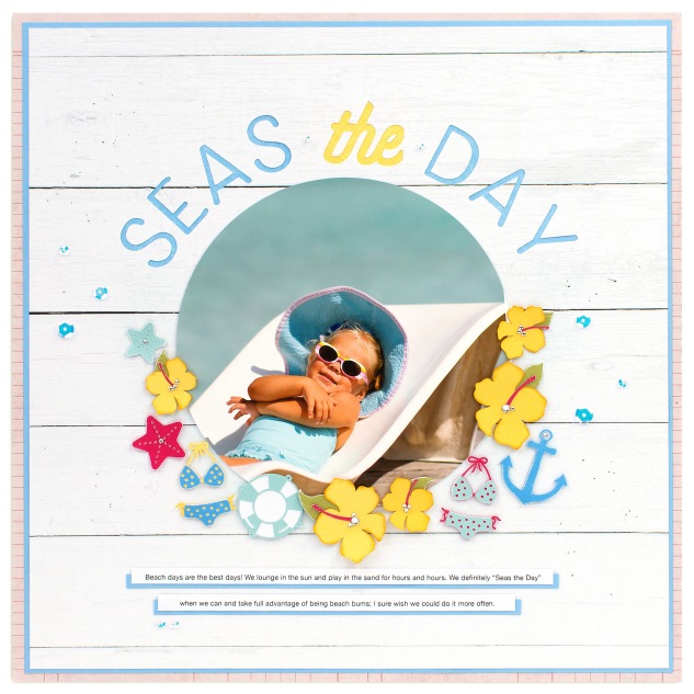
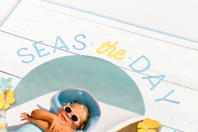
On the page above, you’ll see that we’ve used some of the tools in Design Space to add and curve text to create a unique title. Not only does the title come from the You Are Here Cricut® collection, but so do all of the smaller shapes decorating this page! The You Are Here collection has travel-themed words and shapes for anything from an international adventure, spa retreat, and camping to a day at the beach, just like you see here. Whether your travels take you near or far, this collection has coordinating titles, shapes, and sentiments to document those memories.
Don’t forget, the steps below show you how to create projects in Design Space from a desktop or laptop computer. If you use the app on a mobile device, the buttons and tools will be located in slightly different places on your screen. Typically the same features are available on any device, but when working with text, the Curve tool isn’t available on a mobile device.
Adding Text
When you want to insert text on the canvas, click on Text in the Design panel. A text box and a completely new section of the Edit bar will appear. This is the Text Edit bar, and the tools available here are, as you can probably tell, specifically designed to use with text. In the Text Edit bar, you can choose your font and the style (regular, bold, italic, etc.). You can also do things here like adjust the size, spacing, and even the curve of the font. Simply type in the text box, and then use the tools to manipulate the letters.
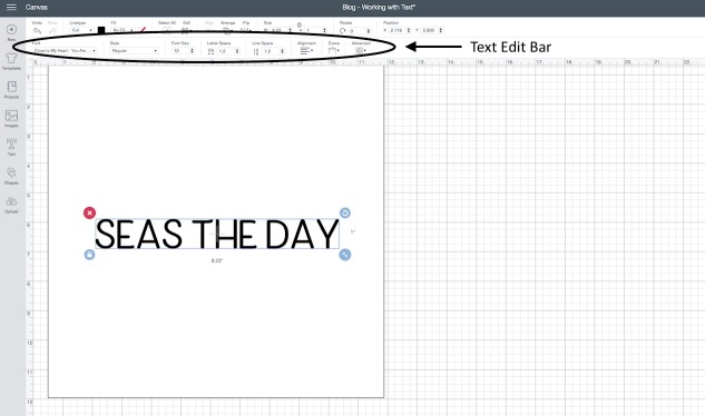
Under Font, you can search for specific fonts, like the one from You Are Here. Letter Space and Line Space both do exactly what it sounds like. Letter Space allows you to bring individual letters closer together or farther apart. As you adjust the spacing, the higher the number, the farther apart they will be. Line Space changes the space between the lines of text in a paragraph.
There are a couple other options you will want to be familiar with in the Text Edit bar. You can use Alignment to move your text to the right, left, or center of the text box. Under the Advanced tab, you have several choices for ungrouping your text. For example, let’s say you’ve arranged your text for your project, but you want to now adjust the size of just one letter. These advanced tools make that possible. You can select Ungroup to Letters. Each letter can then be manipulated separately. Under Advanced, you can also Ungroup to Lines or Ungroup to Layers.
Curving Text
Our favorite part of the Text Edit bar is Curve. This makes it incredibly easy to curve your text, even into a circle. Select the line of text and then select Curve. Moving the cursor to the right will curve the text downward, and moving the cursor to the left will curve the text upward.
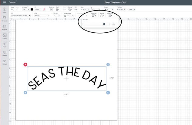
There are a few things to remember with Curve. You can’t use this tool with multiple lines of text. You can only curve one line. There also will be times you will want to pay attention to the Diameter number. If you want to curve one line of text down and one line of text up, entering the same number for the Diameter will ensure the curve of the text remains the same for both the top and bottom.
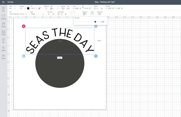
With a project like this, insert a square from Shapes in the Design panel and change the size to 11.375″. To help us curve the text for our page, we inserted a circle from the Shapes section and sized it to 6″ to represent the photo we planned to use. This made it much easier to visualize how to curve the text around the photo.
Slicing Text
Often when you’re working with text, you might want to cut that text from another shape, like we did on this scrapbook page. This is where the Slice tool comes in handy. We showed how the Slice tool works in our last Design Space post with cards (check it out here in case you missed that one.) Just to remind you, you can find the Slice tool at the bottom of the Layers Panel.
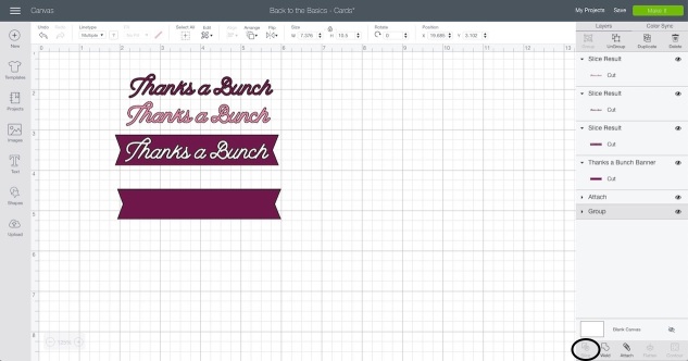
Again, for this particular project, use the 6″ circle to help you see where things will go on your page. Once you have your placement down, select both the text and the 11.375″ square, and click Slice in the Layers panel. You’ll now have text sliced from the square for your page! Delete the extra sliced text. You won’t need it. When you cut the project, you’ll have the title sliced into a square you can layer on top of another piece of cardstock or paper.
Pro Tip!
You might have noticed that on our page the “the” looks different than “SEAS” and “DAY,” and you’re right! It does have a Canary piece of cardstock behind it, but the font is also not the same. You can use the same You Are Here font for the entire text and curve it, or you can do this more advanced trick to get the “the” for your title. This is actually a word we sliced from a different shape in the You Are Here collection.
To do this, you’ll first insert the sentiment. It’s shape #M28C97B2. This shape also says “SEAS the Day,” but it didn’t fit quite right on our page. That’s why we chose to work with the You Are Here font instead. To get the “the,” ungroup the image and delete the background piece. Then insert two squares from the Shapes section. These squares are going to help us slice what we want from this shape.
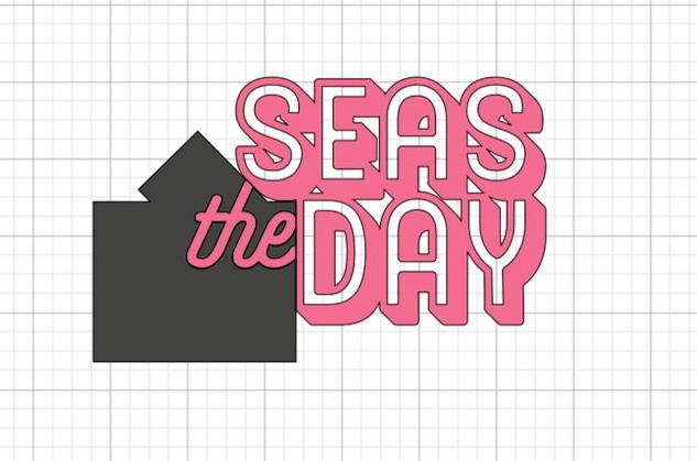
Feel free to resize the squares into smaller rectangles to make them easier to work with. Place one over the word against the right edge of the “e.” Rotate the second one to match the angle of the “h.” Once “the” is completely covered, weld the two squares together BEFORE you slice. Then select the welded squares and the sentiment and click on the Slice tool.
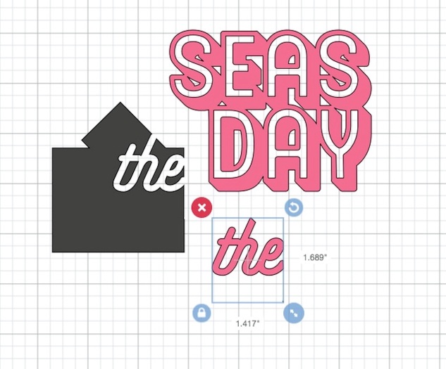
You’ll now have the word “the” as a separate piece! Don’t worry if it takes you a couple tries to get it. That’s where the Undo button comes in handy. Just click that a few times and try again.
Put It Together (Add, Curve, and Slice Text)
Follow the steps below to put it all together and make the Seas the Day layout!
- First, insert a square on the canvas and resize it 11.375″.
- Then insert a circle and resize it to 6″. This circle is just to help you place your text where you want it to slice from the square.
- Insert the text by first clicking on Text in the Design panel. To find the You Are Here font, click Font and then search for “You Are Here” in the search box. Then click on the font to use it.
- In the text box, type your title. You can either do the complete title or you can use the pro tip we explained above. It’s up to you! Typing the complete title is definitely easier. Your page will just look a little different. If you go with the pro tip, you’ll want a text box for “SEAS” and then insert a second, separate text box for “DAY.”
- Adjust the size of your text BEFORE you curve it. We used 1″ for our font, but you can feel free to make it whatever size you want.
- Now use Curve in the Text Edit bar to curve your text as desired. For those of you using the pro tip, place the sliced “the” at the top of the circle. Then curve “SEAS” and “DAY.” Once all three words are placed how you like them, select them all together and group them. This will make it simpler to slice later on.
- Once your text is placed and curved around the circle, you can delete the circle. You don’t need it.
- Now it’s time to slice! Select your text and the 11.375″ square and click Slice at the bottom of the Layers panel. Delete the extra sliced text.
- Before cutting your project, insert any other additional shapes you want to use on your page. We choose to add shapes like the starfish and hibiscus, but you have many, many options from the You Are Here collection. It’s up to you!
- Color your project pieces to make it easy to cut on the right color of paper or cardstock. Then select Make It in the top right corner and cut your project pieces.
- Put your page together and embellish with a few sequins and sparkles!
These suggestions for using text in your Design Space projects are just the beginning. As you become more comfortable with these tools, the possibilities only continue to grow. Let us know in the comments if there are any other Design Space questions or topics you’d like to see on the blog.
Cricut® Shapes:You Are Here
1.45″ #M275F9BD
1.6″ #M27601D0 (cut 2)
1.1″ #M27601D0 (cut 3)
1.3″ #M27602DF
1.7″ #M2760F25 (cut 2)
0.75″ #M2763040
1″ #M2763040
3.228″ #M28C97B2
1″ Font
1.6″ #M27601D0 (cut 2)
1.1″ #M27601D0 (cut 3)
1.3″ #M27602DF
1.7″ #M2760F25 (cut 2)
0.75″ #M2763040
1″ #M2763040
3.228″ #M28C97B2
1″ Font

No comments:
Post a Comment
Thanks for showing some {{{love}}}....