If you aren't new to Studio J and want to login, click here...if you're new and want to see what it's all about, click here and create a user name and password. Remember it's FREE to create and a great price if you decide to purchase. As always, if you have any questions, call or e-mail me (contact information can be found using the Studio J link above)!
Here is my 4th Studio J layout I made for Convention.
Here's what I like about this layout:
- I've had these pictures uploaded on my computer for years (2 and some months to be exact) but have never printed them. I do that often. I was able to make this layout without having them developed and that's a BIG PLUS to someone who never gets around to developing pictures (that's a whole 'nother blog post, my friends...I have a problem and I own it!)
- I was able to stitch on this layout without ever sitting at my sewing machine!!!
- I was able to add a scalloped border without using my corner-rounder or my cricut machine
- I was able to journal using white ink which I hardly ever get to do using the conventional method of scrapbooking
- And...the #1 reason I {{heart}} this layout...I didn't have to print this MASSIVE photo on the left...I just uploaded it with all my other photos I wanted to use for this layout and dropped it into a photo well. Studio J resized it for me and the print quality was GREAT (remember...if you try to increase the size of a photo and the resolution isn't what it should be for such a large photo, Studio J will alert you so you can choose another photo!)
Here are some detailed photos of what I did to create this layout...
CHOOSING THE PAPER PACKET, THE PATTERN AND THE KIT MIX (instructions are before the photo):
1st...can you guess what Paper Packet was used for this layout? Give up? Remember this one...
Yeah...I can't believe it either but this is how I did it...I chose the Paper Packet from a HUGE list...here's what it looks like on the screen and there's TONS more that you can't see!!!!
-------------------------------------------
I told it what Pattern I wanted from a HUGE list...I chose the Powerful Trio pattern which is shown highlighted (you can click on any of these photos to make them bigger)...
-------------------------------------------
Then...I got to choose with "kit mix" I wanted...I chose 2
----------------------------------------
Here's what the layout looked like before I started tweaking it...
---------------------------------------
Here's what the layout looked like after changing some colors, deleting journalling wells and changing some B&T to cardstock and vise versa...What a transformation, huh...the possiblities are ENDLESS!!!!
-----------------------------------
ADDING STITCHING (instructions are before the photo):
Choose EMBELLISHMENTS from the left side toolbar...use the drop down menu to select STITCHING then select the RUNNING STITCH and change the color to COLONIAL WHITE...
Drag and drop the stitching to the desired location...in this instance, my Outdoor Denim Cardstock Strips..starting with the bottom...
Resize 'till you get it where you want it then copy and paste for all the other stitching...one more COOL thing about Studio J...the little blue lines show you when everything is straight with other elements on the page and in the center...can you see the blue lines - one is vertical showing that it's centered and the other is horizontal showing that it's even with the stitching on the left (click on the photo to see it larger then maybe you can)...Here's what the stitching looks like all finished...
------------------------------------
One more detail to show you...you're going to be AMAZED!!!
Remember I said that I was able to add a scalloped border without using my corner-rounder or the Cricut...here's how:
I chose the My Stickease form the left toolbar - Medium Accents - Honey circle and dragged and dropped where I wanted it
Then I add more...you can see that the little blue line is telling me that they are straight
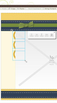
Since I have three, I thought this was a perfect time to "send backward" which is how you get the scallop look, copy and paste...I highlighted all three by using the "Ctrl" button and clicked each one...here they are "clicked"
Then I clicked SEND BACKWARD (you can do this at the top next to PASTE or by right clicking) to get them to look like this...
Then I clicked COPY and then PASTE and got this full row of scallops...
I recreated the same look on the other page by copying and pasting these...here's what it looks like after I have clicked copy and paste and drug them into the center so you can see them better...
Next I finished dragging them over to the right page and then rotated them using the little circle arrow in the top left...I also had to add some more to finish out the row...
Then I sent them to the back so they would appear as scallops...
----------------------------------------------
Here's another look at the finished page with photos and journalling (notice my white journalling on the Topiary journal well) and some other minor touches...Pin It


No comments:
Post a Comment
Thanks for showing some {{{love}}}....