Thank you for joining us this GLORIOUS first day of August to show off this month's SOTM from Close to my Heart!
We have fifteen Consultants participating this month so it won't take you long to prop your feet up and check out all the lovely artwork (and leave some love along the way).
If you've come from Jen Rubio, you're on the right track...keep on hopping around 'till you get back to where you started. If you started at the beginning, then you're almost done because I'm the last stop. If you're starting here, WELCOME!
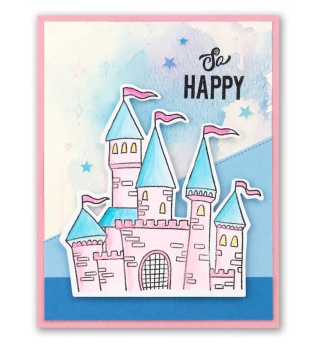
This stamp set is FULL of fun sentiments that can be used for just about anything...take a look at this month's SOTM - From Me To You...
I pulled some scraps from the Mix-In paper that was on my desk and this card came together in 2 MINUTES...I kid you not!
Thanks for stopping by...you can hop on over to Cat's Blog to start over or continue on!
As you know, we love exploring new techniques here at Close To My Heart, but we also love expounding on old favorites. Recently, we’ve had a lot of fun playing around with various watercolor techniques, and we’re so excited to share a couple with you today! We asked a few of our artists to demonstrate some of their ideas in speedy video clips, so you can see them in action, too!
The first technique we’ll be looking at today is a splatter technique. This watercolor method allows you to add a little “controlled crazy” to your project. J
As you can see in the video, you’ll start by using a waterbrush to activate your watercolor paints by adding a drop or two of water. Once you’ve selected and activated all the colors you’d like to use, dip the waterbrush into your color of choice and swirl it around a bit, making sure to get a decent amount of paint onto the tip of your brush.
When you feel like the brush is sufficiently saturated, bring the brush over your page and lightly tap it against your index finger. This will send a series of splatters raining down onto the page to create a fun, haphazard feel.
For our next technique, we’ll be showing you how to create and replicate a soft color transfer.
To recreate this look, paint directly onto your All-purpose Mat with your waterbrush. The paint will probably stay in small droplets and won’t want to spread across the mat, but that’s just fine. When you’ve added all the colors to your mat that you’d like to use in the paint puddle, gently lay your card or page down over the paint.
When you lift it up, you should have achieved a color transfer that is both soft and seamless. If you’d like it to be blended out a little more, you can swirl your card or base page around in the paint, creating the look you see here.
The last technique we’re showcasing today is a combination of two different techniques. (Technique combinations help you to really personalize each project, so don’t ever be afraid to experiment!)
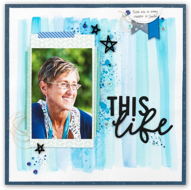
Tip: For pages like this one, it’s not a bad idea to use actual watercolor paper. When you paint over a large surface area, the paper will start to absorb the water and can curl or ripple, which distorts your project. Using watercolor paper is more resilient and shouldn’t ripple or curl as your paint.
For this page, we started by selecting various shades of blue from our watercolor palette. Then, we painted long strokes down the page with a waterbrush. Once we made a couple strokes with our first color, we moved on to our next shade of blue, creating a sort of stripe sequence down the page. By sticking with a single-color theme, it’s easier to achieve a nice blend as you move across the page, and you can avoid unintentional color combination.
Tip: If you’re unsure of how a color will look on the page, it’s a good idea to do a test stroke on a piece of scrap paper. This is especially helpful if you’re mixing two colors together.
Continue alternating between your various colors or shades until you’ve covered the width of your page. Then, you’ll revisit the splatter technique we showed you earlier on in this post. Select one or two of your favorite colors and splatter it across your page. This is another place to be aware of color combination, so we recommend choosing colors that you already used in your stripe sequence. For this example, we stuck with the tried and true blue.
If you want to shake things up even more, gently blend out some of the larger splatters on your page. You can even paint a few new strokes if you want to. It’s really all up to you!
As some of you know by following me on IG and my FB Fan Page, I just returned from CTMH's Annual Convention in the GORGEOUS state of Utah!
This week's H2H Challenge is all about INTO THE WILD and let me tell you that it was so FUN making this layout featuring some of the photos we took on the trip. I am going to need to pull a Stacy Julian and cull down the 750 photos I took...lol.
-------------------------------------------------
Here are some close-ups....I used the recently retired Thin Cuts - Fancy Tags to crop my photos...one for each place we visited...
Welcome to the MIX IT UP Technique Blog Hop featuring CTMH Consultants bringing you fun ways to MIX IT UP.
If you've come from Melissa's Blog, you're on the right track...you'll keep hopping around until you've seen all twelve Consultant Blogs. If you're starting here, WELCOME!
While the MIX-IN paper from CTMH is FABULOUS all by itself, I wanted to challenge myself to use it as it is truly intended...to mix in with other paper packets from CTMH.
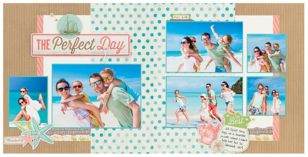
This month, CTMH has brought back the ever so popular SEASIDE and I wanted to make a layout with some POP to it. By adding the Lemon striped B&T and the Sapphire patterned B&T, I think I did just that!
-----------------------------------------------
Here's a closeup of the small pieces that were added...
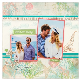
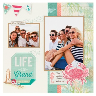
Just in time for all of those sun-bleached memories you’re creating, our beloved Seaside collection is back now and through the end of August! With updated colors—including brand new French Vanilla—, a new 12″ x 12″ coordinating sticker sheet, and a new workshop, our timeless Seaside patterns have just the right amount of beachy bliss to capture the feeling of cool ocean breezes and all that this radiant season has to offer!
This stunning stamp set, with its realistic line designs and versatile sentiments, is not just beautiful but also very easy to use in both scrapbooking and cardmaking. (We’ll show you how we’ve paired it together with the rest of the Seaside collection to make scrapbook pages and cards in the available workshop, below.)
Here it is! Featuring our exclusive colors, French Vanilla (new!!), Glacier, Lagoon, Raspberry, Smoothie, Sweet Leaf, and Toffee, this dreamy paper packet comes with 6 refreshed patterned paper sheets, 2 each of 3 double-sided designs, and 1 new coordinating sticker sheet! The zip strips are also new (and super cute)! Click on the individual thumbnail images to take a closer look!
(You can get a FREE Seaside paper packet by becoming a Close To My Heart Consultant or hosting a qualifying party in July!)
These cardstock colors coordinate perfectly with those in the Seaside paper packet. Each coordinating cardstock pack comes with 12 sheets, three each of French Vanilla, Lagoon, Smoothie, and Toffee; all 12″ x 12″.
Paired with this downloadable workshop guide, the materials in this kit come together to create the gorgeous scrapbook layout, pages, and cards you see here:
12″ x 12″ layout:
12″ x 12″ pages:
4¼” x 5½” cards:
3″ x 3″ cards:
We love this collection so much that we want everyone to have one of these kits to create this artwork. To help with that effort, we’re giving three of the dreamy Seaside Workshop kits away to three lucky winners! To qualify for an entry to win, first make sure you are subscribed to this blog. Then, leave us a comment below telling us what you love so much about this collection or, if you’ve been with us for a while, let us know what other retired collection you love that you would like to see make its way back. You have until 3 p.m. (MST) tomorrow (Wednesday, July 10) to get your entries in. All winners will be notified via email shortly after that—so keep an eye out, it really can be you who wins!