
Where did the time go?!?! I meant to get these posted a week or so ago...I guess "back 2 school season" got in the way...lol
These are some more examples of what I taught at Convention....using COLOR, where to find inspiration, how to combine paper packets, etc. This particular board was using three colors in a triangle on the color wheel...here are some tips and hints:
Holiday Red, Pear & Crystal Blue with two neutrals, White Daisy and Desert Sand - again I let the Crystal Blue color in my photos play its part and only used the color minimally elsewhere.
Don’t be afraid to mix your Paper Packets to get just the right color scheme. Remember that you can use the back side as well and many times this is the side I use when mixing things up.
For masculine cards, let your neutral color dominate and use the other triad of colors minimally to create a dramatic feel without all the frill.
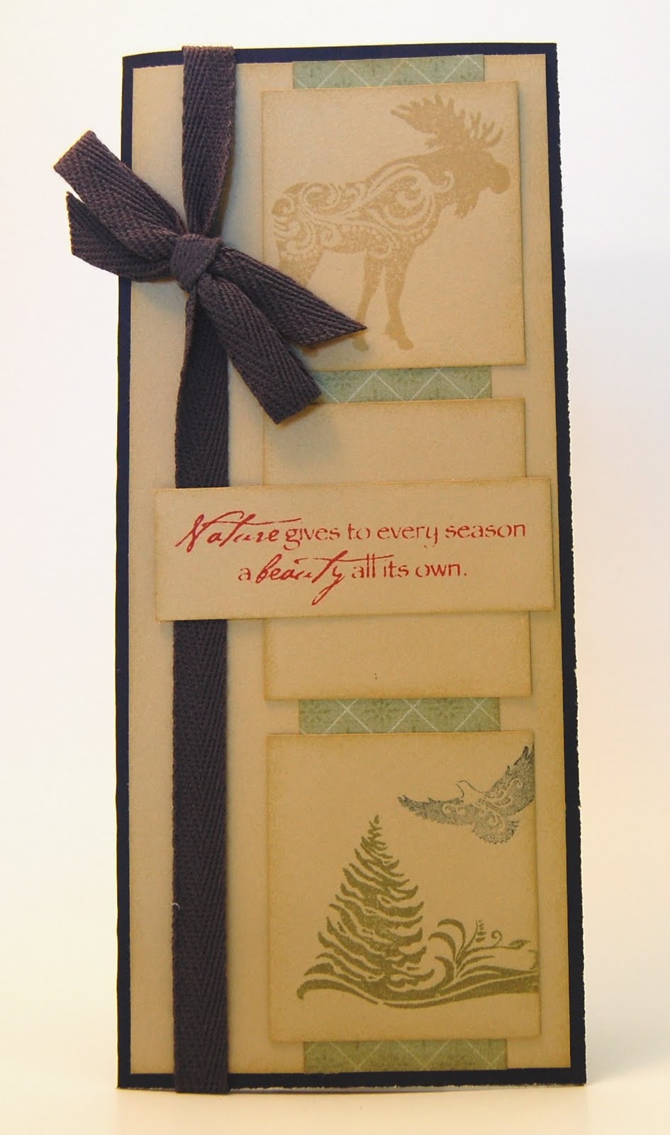
White space is HOT, HOT, HOT right now and as much as I enjoy distressing, sometimes Simpler is better. . . white space creates the illusion of being simple and often eloquent.
When using clear cards, have some of your elements on the front and some on the inside. . .just make sure to cover up all your top elements by cutting an identical piece to hide all the glue and 3-D Foam Tape.
-----------------------------------
On this layout, I let the blue in the photos act as the majority of my Crystal Blue in the color scheme (only adding it again in the title bar)...

-----------------
Close-up of my CUTIE and the buttons sewn on the side (LOVE these Clear Craft Buttons and they're on the discontinued list so you better get them while you can!!!)

----------------------
Clear Card....the clouds and buttons are on the front and the rainbow is on the inside....


--------------------------
Same color combo (Holiday Red, Pear (*NEW*) and Crystal Blue)....anyone recognize the stamp used for the petals???? Check this set out and see if you can figure it out!!!

-------------------------
Here's a close-up.....

--------------------------
A Posey stamp set (can you believe you can get this CUTE stamp set for only $7.95) with window cut out in the bottom right....more clear buttons over the centers of the flowers. I also mixed paper packets....Magic Moments (was a $2, $4, $6 - 8 paper packet so they're all gone :(... and Sweet Home...Colors are Sweet Leaf, Indian Corn Blue and Smoothie (*NEW*)....White Daisy as my neutral...

------------------------
Side view of the "window".....

------------------------
same colors and same stamp set....clean, simple card!!!

--------------------------
Dimensional Elements On Target (small circles) stamped and adhered for dimension....

-------------------------
Masculine card with one of the NEW stamp sets I was given to play with....Colors are Garden Green, Outdoor Denim and Cranberry (my neutral is Bamboo)....

--------------------------
Inside.....

---------------------
Another card...same stamp set...same color combo...
No comments:
Post a Comment
Thanks for showing some {{{love}}}....